A premium Central Coast builder was paying $3,000+ a month for an agency that wasn't delivering. I rebuilt their entire digital presence from strategy to code.
Ace Building Co. is a construction and carpentry business on the NSW Central Coast. They specialise in high-end pergolas, decks, kitchen and bathroom renovations, and architectural carpentry. Over 20 years of experience, fully licensed (320446C), and insured up to $20 million. Their work is genuinely excellent.
The problem was their online presence. They were paying an agency over $3,000 a month for ad management and basic website maintenance. The ad creatives were mismatched, the website was dark and template-driven, and the whole thing looked like a trades directory listing. None of it reflected the quality of what they actually build. Their clients are affluent homeowners on the Central Coast investing in premium renovations, and the website was doing nothing to attract that audience.
They came to me to fix it.
The Audit
Before touching any code, I did a full audit of their existing site, their ad spend, their competitors, and their target market. The findings were clear:
Dark, heavy design that felt more industrial than premium residential
Low-quality imagery that didn't showcase their craftsmanship
Generic copy with no clear positioning for their actual market
Poor SEO structure with missing metadata, no proper headings, and no sitemap
A contact page buried at the bottom with no real call to action
Agency ad spend with no measurable ROI
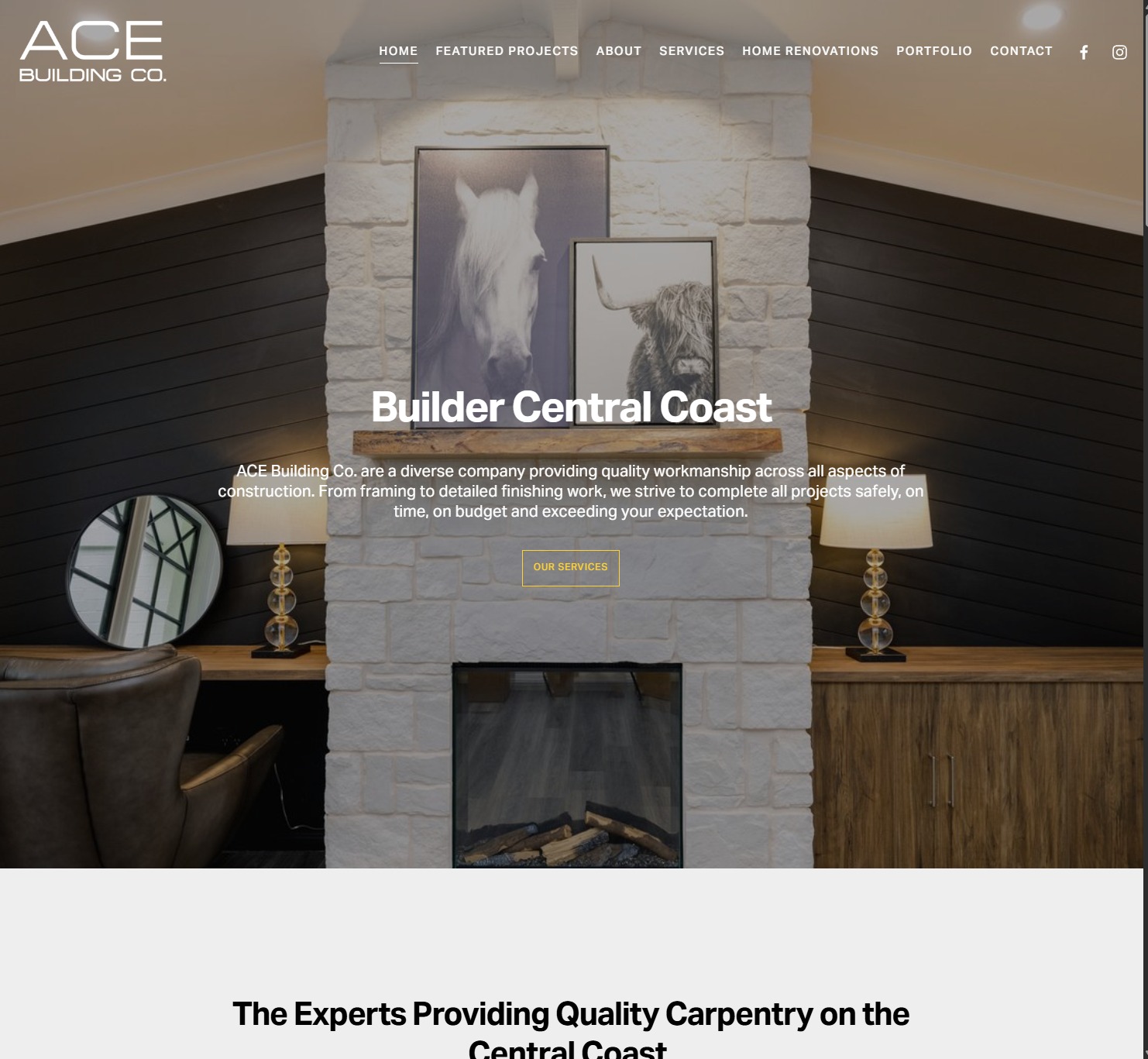
The site was essentially invisible to the type of client they wanted to attract. It looked like every other builder's website on the Central Coast, despite the fact that their work is clearly a cut above.
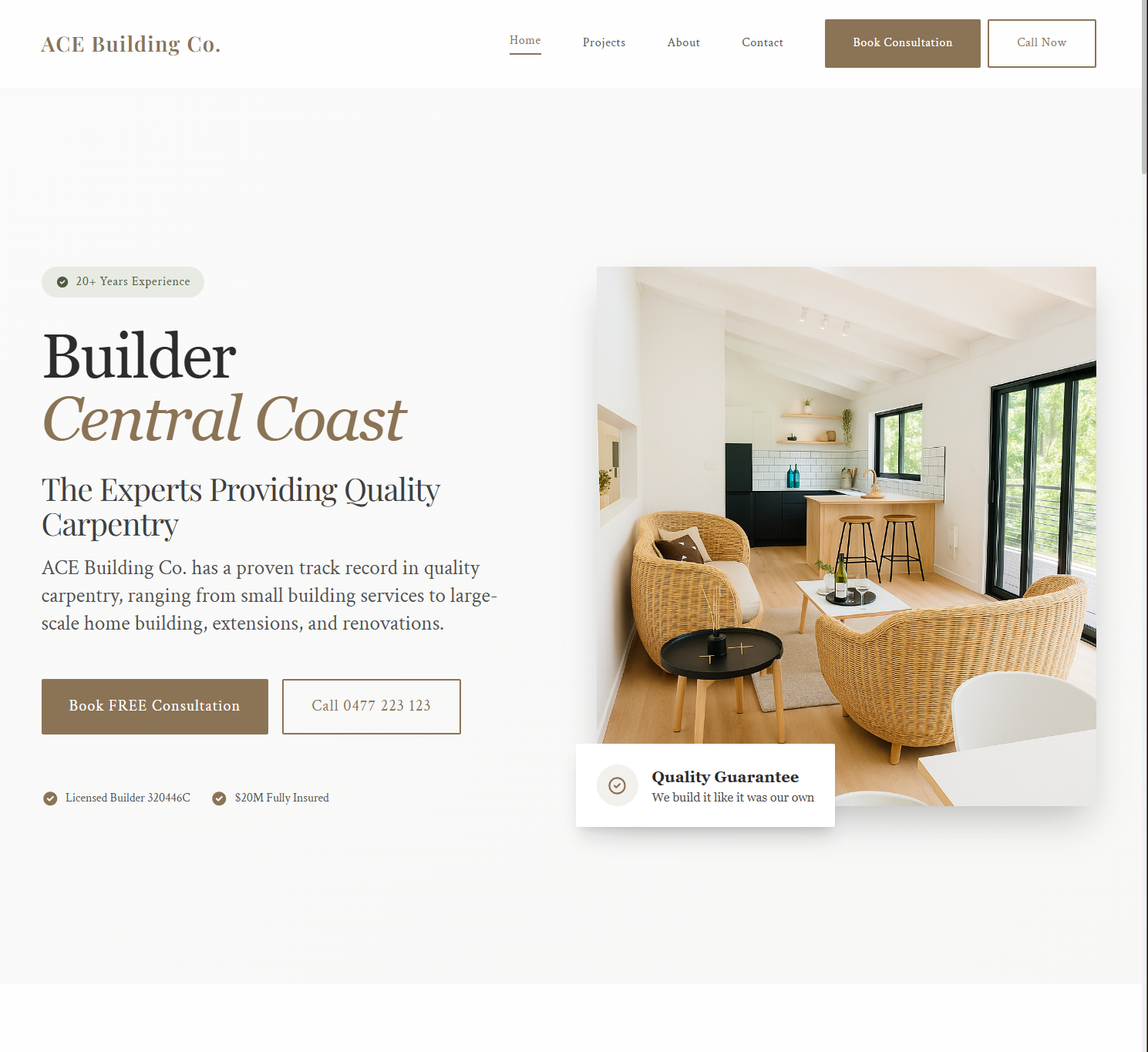
The first thing I did was shift the entire visual identity. The old site used a dark background with yellow accents, which felt more like a mining company than a premium builder. I moved to a clean white base with warm gold accents and soft earthy tones that better reflect the coastal, design-conscious market they serve.
The typography was updated to use elegant serif headings paired with clean sans-serif body text. The overall feel shifted from "tradesman's website" to something that looks like it belongs in a home design magazine. That was the goal: when a potential client lands on the site, it should feel like the kind of business that builds beautiful things.
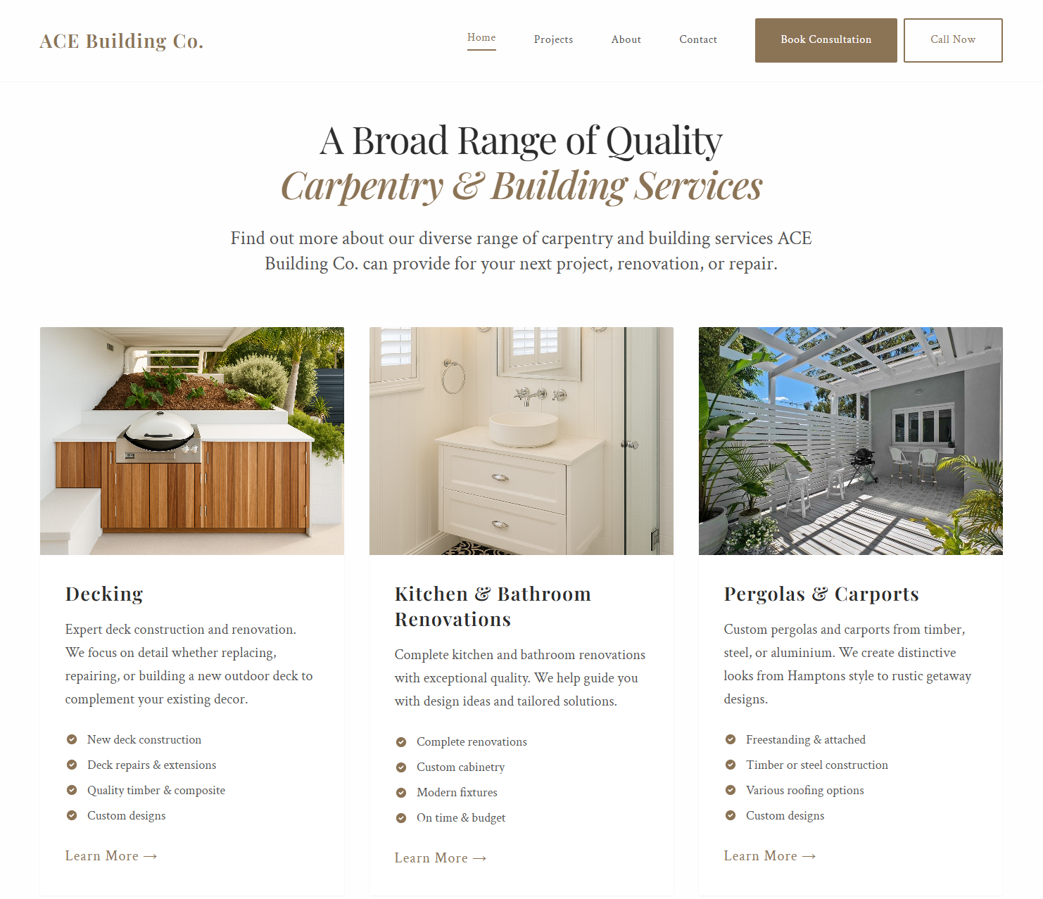
Services section with high-quality project imagery and clear service descriptions
Content Overhaul
The old site had a simple bullet list of services on a dark background. No images, no descriptions, no reason for anyone to click through. I restructured the content into proper service cards with high-quality project photography, clear descriptions, and specific feature lists for each service area: decking, kitchen and bathroom renovations, pergolas and carports.
Every piece of copy was rewritten to speak to the homeowner who is investing in a premium renovation, not just looking for the cheapest quote. The messaging highlights craftsmanship, attention to detail, and the quality of materials used.
Before: Plain list on dark backgroundAfter: Visual service cards with project photos
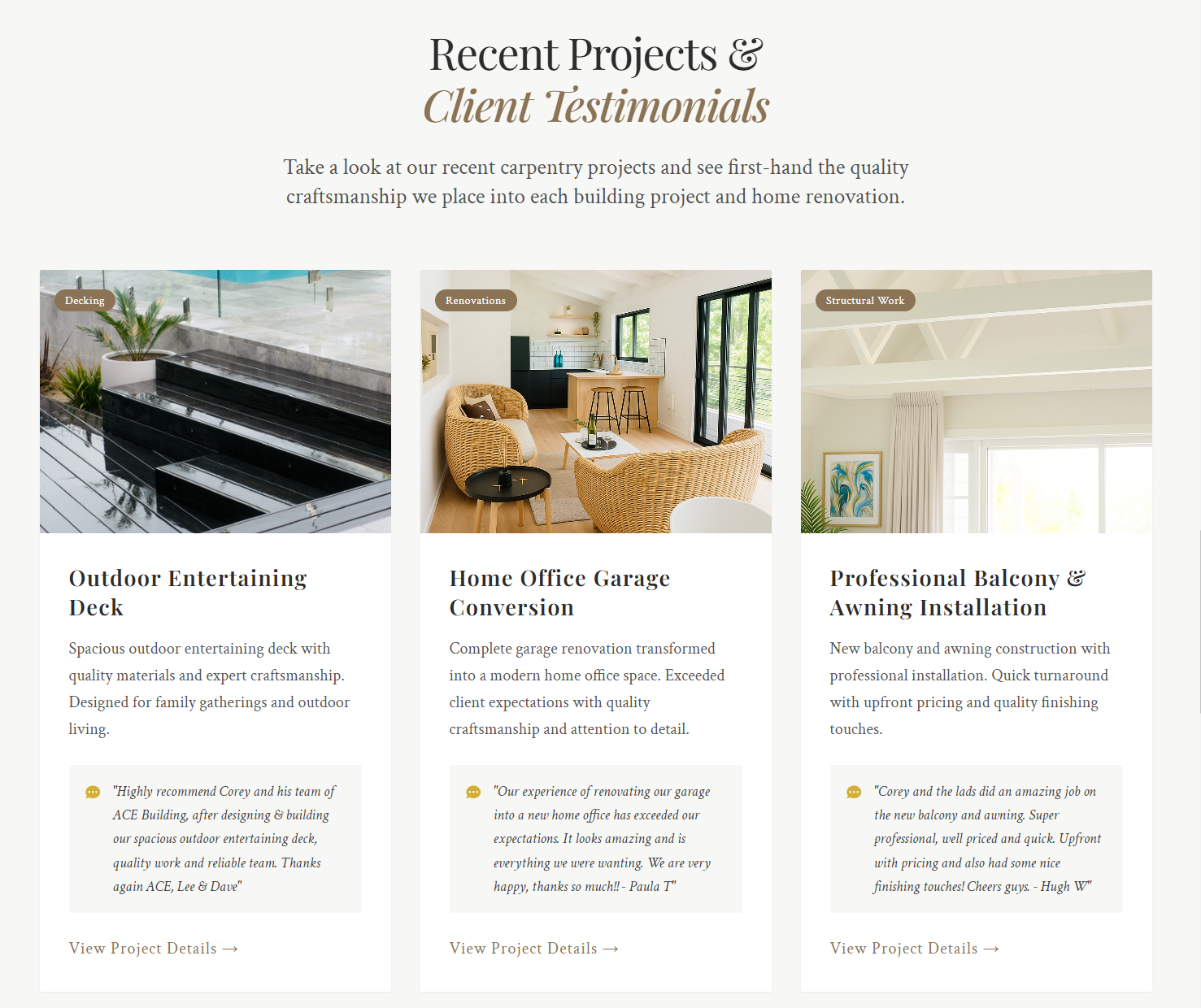
Project Portfolio and Testimonials
One of the biggest missed opportunities on the old site was the lack of social proof. Ace Building has dozens of happy clients and beautiful finished projects, but none of that was being shown properly. I built a projects section that pairs high-quality photos of completed work with real client testimonials directly underneath each project.
Each project card shows the type of work (Decking, Renovations, Structural Work), a description of what was done, and a genuine quote from the client. This is the kind of content that converts browsers into enquiries, because it shows real outcomes from real people.
Project portfolio with real client testimonials built into each card
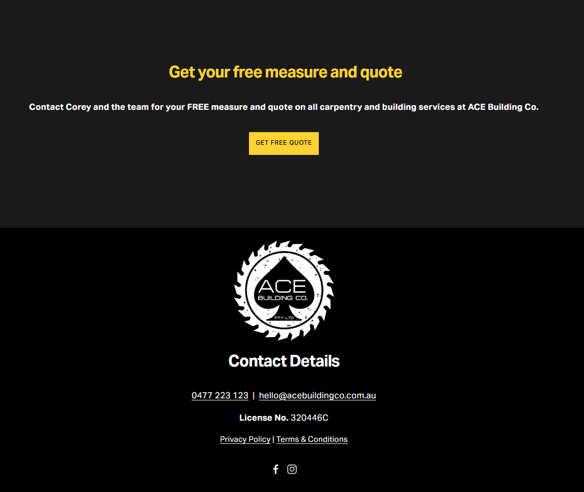
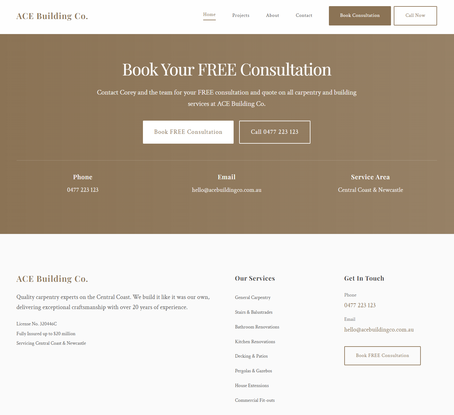
Contact and Lead Conversion
The old contact section was a simple "Get Free Quote" button buried in a dark footer. It was easy to miss and didn't give the visitor any confidence about what would happen next. I redesigned the entire contact flow with a prominent "Book Your FREE Consultation" section, clear CTAs, and visible contact information including phone, email, and service area.
The footer was rebuilt to include a proper site map, service links, licensing details, and multiple contact methods. The goal was to make it as easy as possible for a potential client to reach out, while also reinforcing trust signals like the licence number and insurance coverage.
Before: Buried CTA on dark backgroundAfter: Clear CTAs with full contact details
The Outcome
This wasn't just a website redesign. It was a complete strategic repositioning. Ace Building Co. now has a digital presence that matches the quality of their work, speaks directly to their ideal client, and is structured to convert traffic into qualified enquiries. They also saved over $3,000 a month by cutting the underperforming agency.
What Changed
Before and after the transformation
Before vs After
Old Site
Dark, template-driven design
Low-quality, generic imagery
Misaligned brand messaging
No SEO structure or metadata
Buried contact information
No social proof or testimonials
$3,000+/month agency fees
New Site
Clean, premium custom design
High-quality project photography
Brand positioned for affluent market
Full SEO foundation with proper structure
Prominent CTAs and contact flow
Real testimonials with project cards
Self-managed, zero ongoing agency cost
Technical Implementation
How it was built
React + Custom Design
Modern React frontend with custom component architecture, no templates or themes
Responsive Design
Fully responsive across all devices with custom breakpoints for every screen size
Image Optimisation
Lazy loading, responsive images, and optimised delivery for fast page loads
SEO Foundation
Proper metadata, heading structure, alt tags, sitemap, and schema markup
Need Your Brand Repositioned Online?
If your website doesn't reflect the quality of your work, let's fix that. I do full digital audits, brand strategy, and custom website builds for businesses that deserve better.