Untangling two accounts customers thought were one
Woolworths and Rewards had separate logins that customers assumed were the same. That drove thousands of support calls a week and pages of sign-up drop-off. I led the research and design to merge them into a single sign-on, getting executives, developers and designers aligned on one plan and validating it with users.
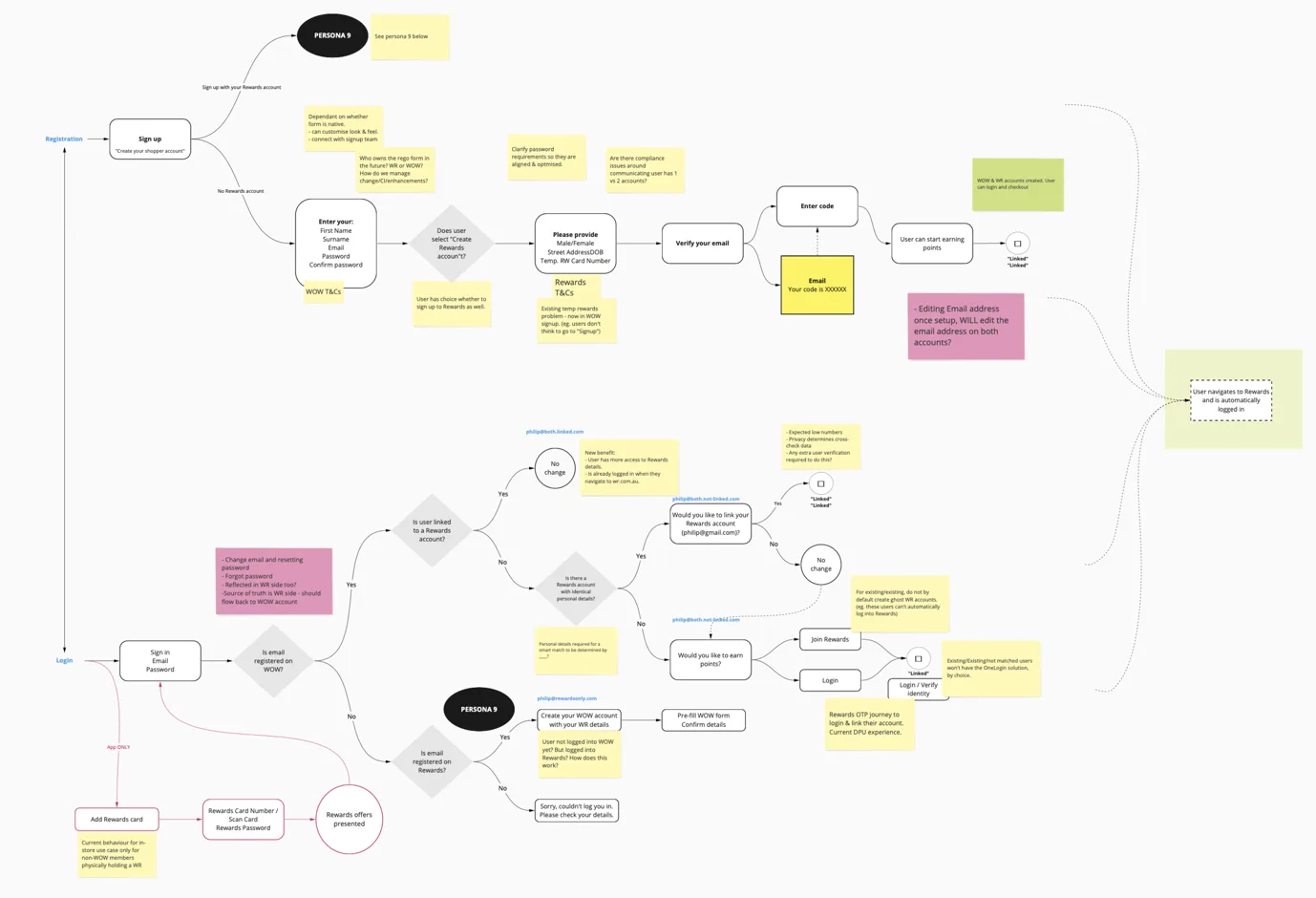
Two accounts customers were certain were one
For years, Woolworths and Rewards ran on separate accounts, and almost nobody realised it. Customers thought Rewards was Woolworths, and took it for granted that their Woolworths, Rewards and Big W accounts were all connected.
They weren't. You could create a Woolworths account and a Rewards account with the same email and password, and unless you happened to follow a specific, non-obvious process, the two would never link. So people lost track of which login they were using, got locked out, and gave up. A short audit of the experience turned up problems on two levels at once: how the system was put together, and how it behaved in front of a customer.
On the surface, the friction was everywhere. Signing up to Rewards from inside the Woolworths app threw you out to a web browser, a 10-to-20-minute detour that lost users at every step. The Rewards sign-up form ran to more than ten separate pages, each one losing more people. One-time passcodes often arrived after the five-minute window they were valid for. And with no "code to login", a forgotten password meant phoning Customer Care just to get back in.
Why It Mattered
A login this confusing is expensive
The real damage wasn't on the screen. It was the cost. The support hub was fielding thousands of calls a week from customers who couldn't log in, and every one of those calls cost money to answer. They also clogged the queue for people with more complex problems, pushing everyone's wait times up.
And it was public. The frustration was showing up as one-star reviews on the Google Play and Apple App stores, the kind of sentiment that shapes whether a new customer bothers to download the app at all.
The business also had ambitions that made this urgent. Woolworths planned to open its program up to third-party partners, and that only works with a single credential customers can use across every partner. Fixing login was also how we'd lay the foundation for where the business wanted to go.
With that much riding on it, and that many teams involved, the first job wasn't to design anything. It was to get everyone to agree what we were solving.
Alignment
Getting everyone to agree what we were solving
A problem this tangled touches a lot of teams, and each one turns up with its own definition of "fixing login." So before a single screen got designed, I ran a series of sessions with senior executives, product managers and tech leads to land on one shared objective. It was one of the most important moments of the whole project. It's what stopped us solving three different problems at once.
We agreed on three things we were solving for:
- Fix the existing login issues customers were hitting across both Rewards and Woolworths
- Implement a single sign-on that could roll out across Woolworths' own brands and third parties
- Reduce the volume of calls to the contact centre
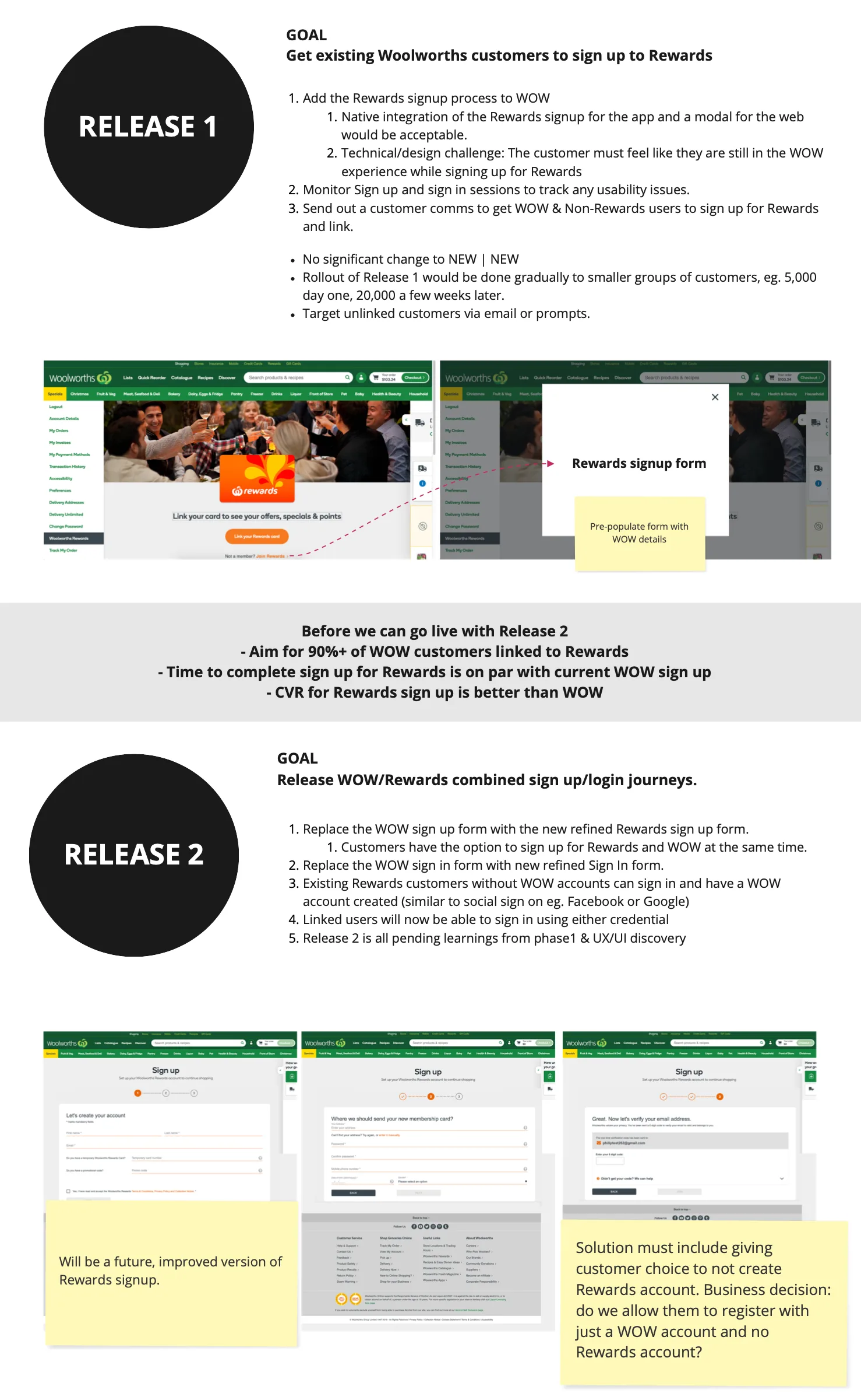
Because the scope was so big, I worked across the teams to break it into two chunks, Release 1 and Release 2, each with its own goals and clear criteria for when we could move from one to the next.
Mapping The Problem
Every journey a customer could possibly be on
With everyone pointed at the same goal, the real difficulty came into focus. "A customer logging in" isn't one journey, it's dozens. Do they have a Rewards account? A Woolworths account? A temporary Rewards card? Are the two linked? Every combination has to behave sensibly, and getting one wrong means locking a real person out.
So I mapped them all. I built a scenario map of every account-state combination we'd have to design for, then turned it into a decision tree that captured the core action a customer needed at each moment. I annotated it with the open questions and compliance issues each branch raised.
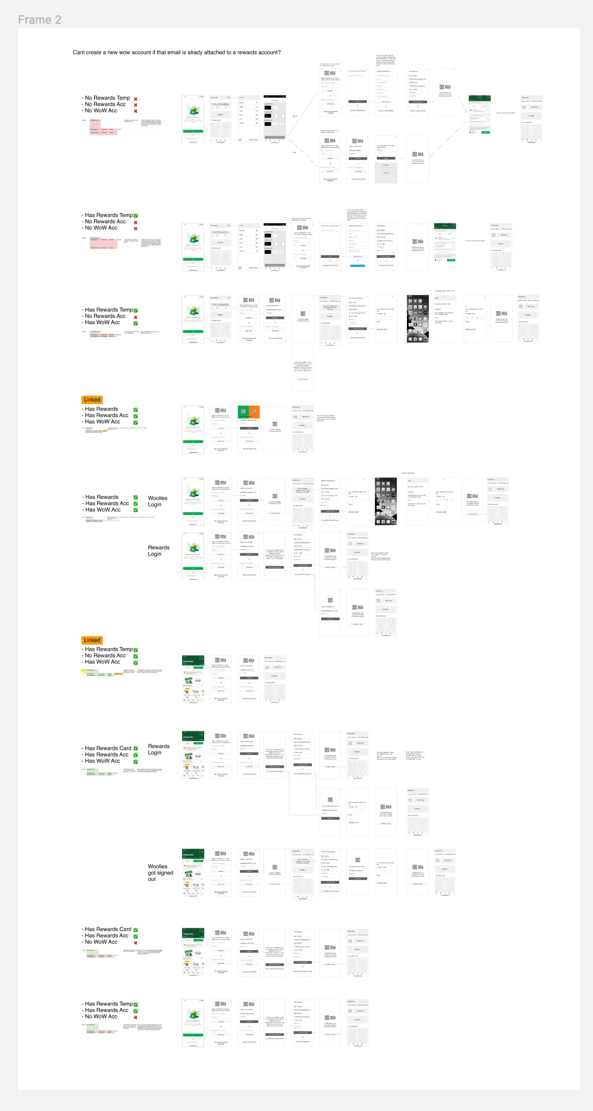
That map did more than organise my own head. It gave the whole team a shared, concrete picture of the problem's real shape, which is what made the design sessions that followed productive. For the first time, everyone was solving the same, correctly-sized problem.
Co-design & Validate
From the team's sketches to a tested prototype
I like to start with the whole team, not alone in a corner. We ran sketching workshops where everyone got their assumptions about the fix down on paper. It surfaces ideas, it gives people ownership of the outcome, and more often than not it's where the foundation of the real solution comes from. Everyone walked the room through their thinking, and we voted the strongest ideas forward.
From those, I built low-fidelity wireframes and ran them past stakeholders and developers to pressure-test technical feasibility early. It was the first time developers could see what they might be building. Alongside that I ran guerrilla testing with users to check the core journey matched their mental model. Testing the riskiest assumptions this early saves a business time and money, because you learn why something doesn't work while it's still cheap to change.
Only after checking in with users again and again did the design move to high fidelity, working closely with the UI designer on interaction detail and consistency across old and new patterns. Then came the test that mattered most.
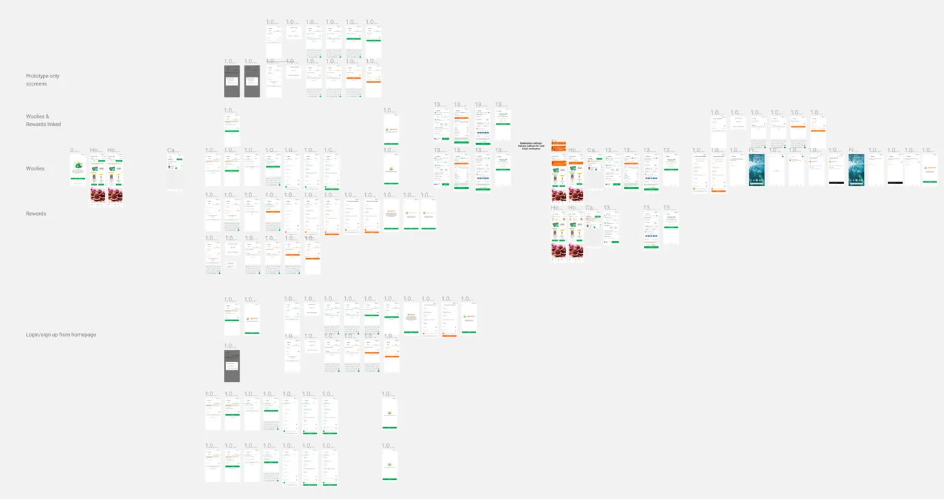
It was deliberately indirect. An unmoderated, unguided study with five participants whose task had nothing to do with login. Their task was to buy groceries. I wanted to know whether the new account and login experience would get in the way of the one thing people had come to do.
A good login is one people never have to think about. They should be able to ignore it completely and still get what they came for.
Outcome
Then it was shelved, and shipped anyway
The ending isn't the one I wanted. After testing, the project was de-prioritised and the team was moved onto other work. That's the reality of building inside a business this size. But we'd already shipped stage one, and its impact on the exact problems we set out to solve has been real and lasting:
- Code to login arrived for both the app and the website, which meant anyone who'd forgotten their password no longer had to ring up to get back in
- Signing up to Rewards no longer dumped users out to a browser and left them stranded, un-logged-in, afterwards
- Customers who create both accounts now stay in the app and are automatically signed in, the groundwork for linking accounts more easily later
- Calls to the support centre for standard login issues dropped to a manageable level
- The negative app-store reviews stopped appearing
None of it is a headline conversion number, but it removed a whole class of customer pain, along with the cost that came with it.
Reflection
What I'd change, and how it ended
One honest gap. We watched the negative reviews dry up, but we never went back to the customers who left them to ask whether their experience had improved. That's the kind of measurement I'd build in from the start now.
The end of the story is a good one, though. The business has recently re-prioritised One Login, and because Release 1 is already live, what's left is the uplift the research mapped out years ago. Two accounts that customers always thought were one are finally on their way to becoming one. Sometimes the most useful thing research does is stay right, and ready, until the business is ready for it.
What the work involved
Research, alignment and validation across a complex service
Methods used
Research, service design and validation activities
Experience Audit
Analysing the current login experience across conceptual model and interface behaviour
Scenario & Decision Mapping
Mapping every account-state journey into a decision tree the whole team could work from
Stakeholder Alignment
Executive, product and engineering sessions to agree one shared objective and scope
Co-design Workshops
Team sketching and voting to surface assumptions and build shared ownership of the solution
Guerrilla Testing
Fast, early tests of the riskiest assumptions against customers' mental models
Unmoderated Usability Study
A task-based validation study checking the new login didn't block a real purchase
Complex problem, many stakeholders?
Some of the highest-value work is untangling a problem everyone can feel but no one has mapped. I bring the research, the shared picture, and the alignment to move it forward. Let's talk.