Turning a small brief into a research-led redesign
Marketing asked for a better way to show promotions on the plans page. A few weeks of research showed the real problem was much bigger, so I ran the interviews, usability tests and three rounds of prototype testing that reframed the whole project and took task completion to 100%.
The project I was handed wasn't the one that needed doing
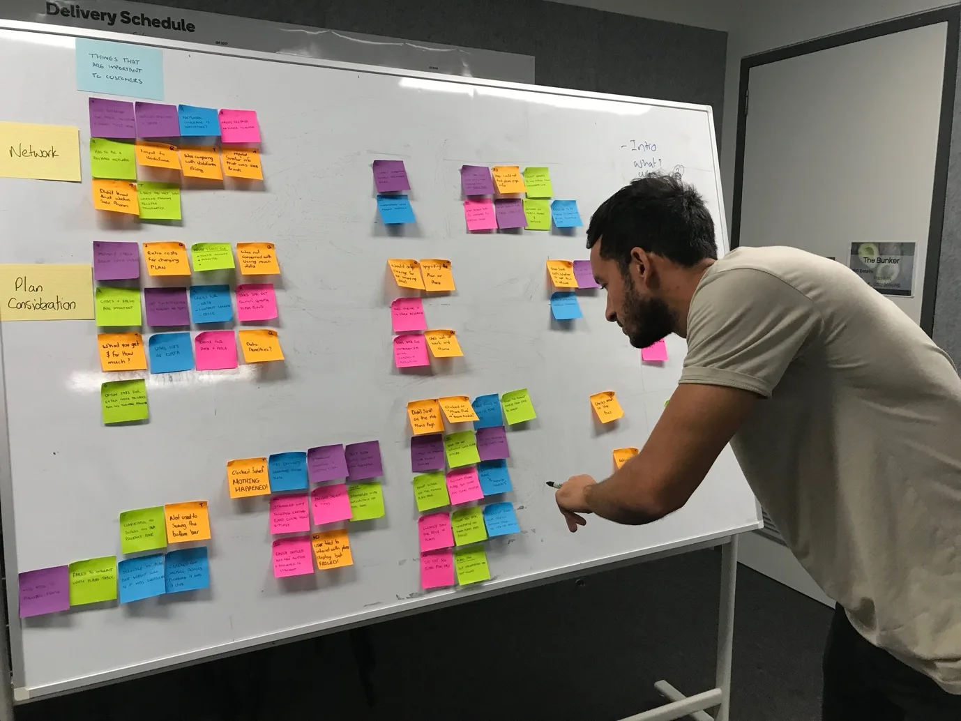
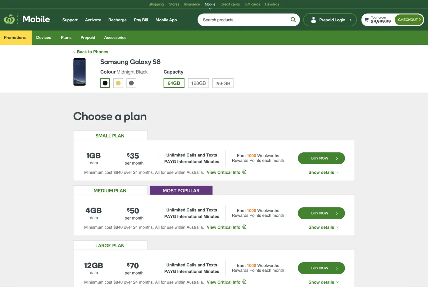
It came in as a small, tidy request. Marketing had no good way to show promotions on the mobile plans page, so someone needed to redesign the plans display module. That was the whole brief: one component, on one page.
I've learned to treat a brief like that as a symptom, not a diagnosis. Promotions weren't landing, fine. But I kept coming back to a bigger question. Why wasn't the plans page converting in the first place? Before I touched a single component, I wanted to know whether "show promotions better" was the real problem, or just the part of it that was easy to see. I asked for a week to find out.
One week turned into a few, and the findings changed the whole project. The friction wasn't in the promotions module at all. It was spread across the entire journey to buy a phone. The brief didn't get smaller. It got more honest.
Current-State Research
First, I sat and watched people try to buy a phone
A hunch doesn't move a business, so I needed evidence. I designed a round of research that used three methods together:
- Depth interviews to understand what people care about when choosing a plan
- A moderated usability test with six participants on the live site
- A user-journey map to capture where people got stuck and why
I recruited six participants against a clear screener. They had to be in the market for a new mobile plan and actively comparing providers, with a spread of ages and genders so I wasn't only hearing from one type of shopper. Each session ran for 50 minutes and paired the interview with the usability test on purpose, so I could hold what people said mattered up against what happened when they tried to do it. Every session chased the same questions. Could people navigate the site, did they understand the plans display, could they reach checkout, was it clear what Woolworths Mobile even offered, and what would break that I hadn't thought to look for.
The interviews were blunt before anyone had touched the interface.
100% of participants named price as a key consideration, 80% named data, and 80% named a reliable network. 60% resented being charged for extra data. Whatever we designed had to lead with the things people were really deciding on.
"I'm looking at how much data I can get from a phone company more than the amount of free calls." — Frank, research participant
That was what people said they wanted. What they could do on the site was another story, and the usability tests made the gap clear.
Synthesis
Six messy sessions, four clear problems
Raw research is just noise until you make sense of it. A colleague and I put every observation on the wall, pulled out the key moment from each participant, and grouped them until the patterns showed up. They fell into four themes: what people look for, interaction issues, state and usability problems, and how content was being read.
The interaction problems were the worst. On the plans display, people couldn't tell which plan was selected. Some expected "Select" to take them to a new page. Others never noticed the "Buy Now" footer updating as they switched plans. The navigation misled them too. "Mobile Devices" looked clickable, so every participant tried to click it and nothing happened, while several other labels pointed to the same page. Content tucked under the big hero banners got missed again and again.
Underneath all of it sat one root problem. There was no single, obvious path through the site. People took several different routes to reach the same place. Most could finish the task eventually, but nearly all of them struggled somewhere along the way, and "eventually, with difficulty" is what a low conversion rate feels like from the inside.
- People couldn't tell which plan was selected, or that the buy footer was updating
- Every participant tried to click a navigation label that wasn't a link
- Duplicate nav labels led to the same page, adding confusion
- Several journeys reached the same place, with no clear best path
- Content below hero banners was regularly missed
These were real problems, but a wall of sticky notes doesn't convince a boardroom. For that I needed numbers.
Triangulation
Stories are persuasive. Stories with numbers behind them are hard to argue with.
So I put the usability findings next to the analytics. The site was reaching around 50,000 people a week and converting only a small share of them. That was the same friction I'd just watched people hit in person, showing up in the data. The two told the same story from opposite ends.
Working back from the sessions, I reframed the site around the core tasks people were there to do, in their own words: buy a phone, buy a plan, buy accessories, or buy a prepaid SIM. That short list became the backbone for rebuilding the experience around how customers think, instead of how the catalogue happened to be organised.
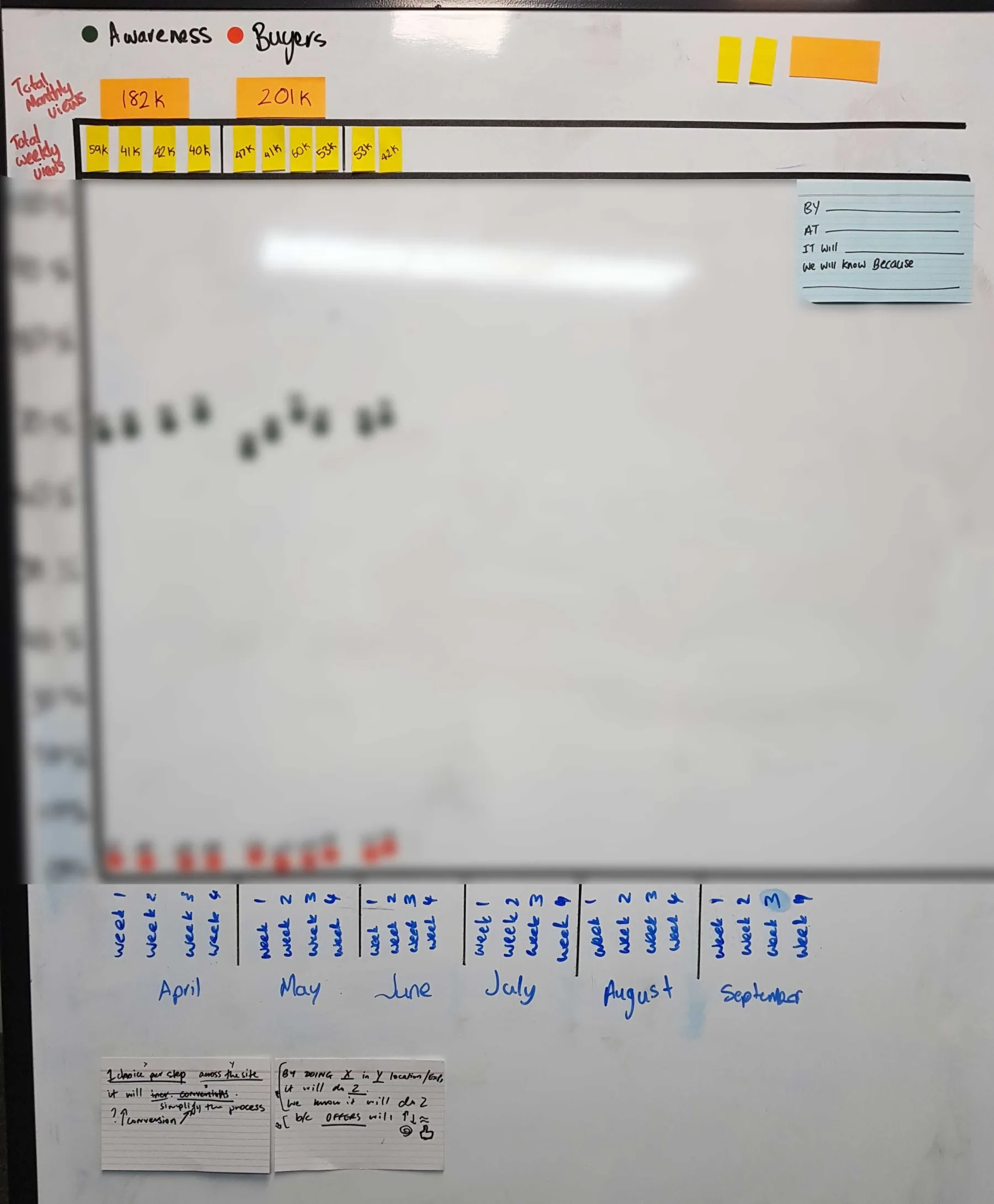
With the real problem sized and agreed on, the design work could finally start.
From Insight to Structure
Rebuilding the journey around how people shop
Starting from those core tasks, I built user flows that matched how people already thought, instead of fighting it. The research pointed to five primary sections as the natural entry points, and to a device-first journey that fed customers into plans, which was the order most people shopped in anyway.
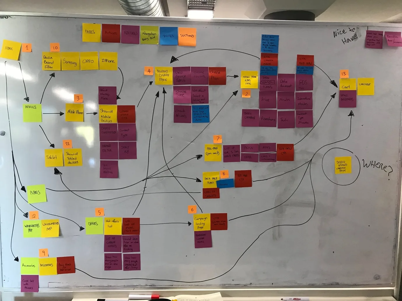
This was also where the team saw how modular the site could be. Breaking it into clear, reusable sections meant we could keep development effort down without hurting the experience. To decide where to start, I ran a quick prioritisation exercise with the five designers. Each of us placed a numbered card, one to thirteen, on the pages in the order we thought we should tackle them. A sprawling scope became an agreed roadmap in an afternoon.
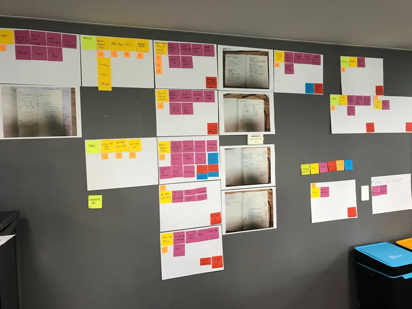
But a structure on a whiteboard is still a theory. The only way to know if it worked was to put it in front of people.
Prototype & Validate
Then I tested whether any of it worked
Low-fidelity sketching ran through the whole project. It let me test ideas with stakeholders and subject-matter experts quickly, before anything expensive got built. But sketches only get you so far. The real test was a prototype in someone's hands, answering one question. Did the fixes fix anything?
The first prototype taught me something on day one. I'd built it in black and white to keep the focus on structure, and in internal testing people couldn't tell where they were meant to click. They couldn't find the calls to action. So I added colour back where it carried meaning: navigation and CTAs. A small change, and it came straight out of watching people struggle.
From there the design went through three rounds of usability testing, each one built to stress-test the work and feed the next version. Nothing shipped because someone liked it. It shipped because testing showed it beat what came before.
A design that tests well is only half the job. The other half was getting the business to back a project three times bigger than the one it signed up for.
Bringing People With You
The hardest thing to redesign was the mind of the business
Expanding the scope was never really a design problem. It was a trust problem. The project started as a small module tweak, and here I was arguing the whole journey needed work. Instead of asking stakeholders to take that on faith, I walked them down the same road I'd been down.
I brought them into the usability sessions to watch real customers struggle, and that was the turning point. Watching someone fail to use your site, right in front of you, lands differently to any slide deck. When people couldn't make it, I ran playback sessions to take them through the findings, always with the analytics next to the stories so there was data behind every claim. The conversation moved from "why are conversions low" to "our site can't handle the basic needs of our customers," and the bigger scope stopped being a hard sell.
Outcome
What the testing showed
Here's where it landed. By the time I wrote it up, the redesign was still in development, so I won't claim a live conversion number I didn't have. What I can stand behind is the final round of usability testing: 50 participants, our prototype against the live site and competitors.
- Participants completed their task around 60 seconds faster on our prototype than on competitor sites
- 76% felt the prototype was at least as good as competitors
- 56% preferred it to the competitor sites outright
- 81% rated the task easy or very easy
- 100% task completion rate
A redesign is a guess until the market votes on it, so I set up dashboards before launch to measure the effect on live conversion once it rolled out, instead of assuming it. That's the point of research for me. It doesn't stop when the design ships. It's how you find out whether you were right.
Reflection
The most important work happened in week one
Everything that came after, the interviews, the affinity wall, the rebuilt journey, the stakeholders won over, traces back to one decision I made before any design existed: to not take the brief at face value, and to ask what was really going on. A component tweak became an evidence-backed case for fixing the journey that was losing customers, and the team got the confidence and the roadmap to do it. Give me a small brief, and the first thing I'll do is check it's the right one.
The research toolkit
The methods behind the redesign
Methods used
Research and design activities across the project
Depth Interviews
One-to-one conversations with in-market shoppers to understand real priorities and decision-making
Moderated Usability Testing
Task-based sessions on the live site and, later, on prototypes to observe where people got stuck
Journey & IA Mapping
User-journey maps and a restructured information architecture built around core customer tasks
Affinity Mapping
Synthesising raw feedback into four clear insight themes the whole team could act on
Analytics Triangulation
Pairing qualitative findings with traffic and conversion data to size and prioritise problems
Stakeholder Research Socialisation
Bringing stakeholders into sessions and playbacks to build buy-in for an expanded scope
Want research that reframes the problem?
I use research to find the real problem before I design the solution, and to prove the solution works before it ships. If that's the kind of thinking your team needs, let's talk.