Hero
heromarketingOpening statement for a page: eyebrow, headline, lede, actions.Design system
Not a styleguide that drifts: the swatches are read from the token file at build time, and every block below is the real renderer fed its real defaults from the CMS registry. When the system changes, this page follows, because it has no content of its own.
Both themes define the same names, so components are theme-unaware. Flip the toggle in the header and every swatch above re-resolves. Tailwind’s stock palette is deleted at the theme boundary; if a colour isn’t listed here, no utility for it exists.
Fraunces for display, Inter for text, Geist Mono for labels, all variable and self-hosted. Sizes are fluid clamps, not breakpoints.
--text-display-xl: clamp(2.85rem, 1.65rem + 5vw, 5.6rem)Back them up.
--text-display-l: clamp(2.25rem, 1.55rem + 3vw, 4rem)Research first, then build.
--text-display-m: clamp(1.8rem, 1.4rem + 1.7vw, 2.8rem)How a project runs
--text-display-s: clamp(1.4rem, 1.25rem + 0.7vw, 1.85rem)The architecture decision
--text-lede: clamp(1.1rem, 1.02rem + 0.35vw, 1.3rem)Before anything gets built, the real problem gets found.
--radius-s--radius-m--radius-l--radius-xl--radius-pill--shadow-soft--shadow-raised--duration-fast: 140ms--duration-base: 240ms--duration-slow: 480ms--duration-reveal: 700ms--ease-out-soft: cubic-bezier(0.22, 1, 0.36, 1)--ease-in-out-soft: cubic-bezier(0.65, 0, 0.35, 1)Scroll reveals honour prefers-reduced-motion and disable entirely without JavaScript.
An eyebrow label
The full set is deliberately small: Button, Container, Section, Heading, Eyebrow, Prose, SmartImage. Anything larger is a block.
Every content block the CMS can place, in registry order. Each specimen is the production renderer fed the same defaults the “Add block” button uses. One source of truth, three consumers: the site, the admin, and this page.
heromarketingOpening statement for a page: eyebrow, headline, lede, actions.articleHeadercontentCase-study opener: title, standfirst, project facts, cover image.Case study
A one-paragraph summary that sits under the title and earns the read.
prosecontentLong-form markdown on the reading measure.Body copy on the reading measure, with emphasis, a link, and room to breathe.
A supporting quotation, when the argument needs one.
figuremediaA single image with an optional caption.gallerymediaA grid of images with optional captions.quotecontentA large serif quotation with attribution.A quotation that earns its serif italics, one sentence someone actually said.
statscontentA row of large numbers with labels.stepscontentA numbered sequence showing how a project runs.What happens first, in a sentence or two.
What follows, and why it matters.
projectsmarketingCurated project cards with imagery, stack tags and outcome metrics.Stack · Discipline
One paragraph on what was built and what changed because of it.
collectioncontentAutomatic listing of pages under a path, from their card metadata.Specimen
Rendered from real published pages under research/, not fixture data.
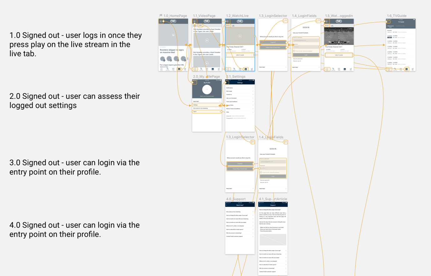
Fox Sports · Product design
Live streaming needed to fit alongside scores, stories and the existing sports experience. I mapped the affected journeys, facilitated stakeholder sketching and tested a prototype with eight internal participants before the project was deprioritised.
Read the case study
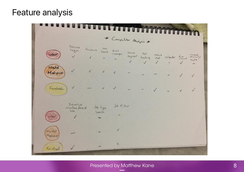
Kaos · Exploratory research
An early product exploration examined how models and photographers find work and assess the people they might work with. Research themes, feature comparisons and journey mapping helped frame the questions a new service would need to answer.
Read the case study
ctamarketingA full-width banner with one action.contactmarketingContact details with an optional enquiry form.profilemarketingPhoto, short bio, profile links and a resume download.dividerlayoutBreathing room: a rule or plain space between sections.chapterNavlayoutSticky links to chapters in a long case study.chapterlayoutA numbered chapter with a linkable heading and introduction.Chapter
disclosurecontentExpandable notes for technical detail or evidence.